Great Experiences Start With A Simple Utility
There is an adage in jazz, “It’s the notes you don’t play that matter.” The same is true for digital solution design. Creating a simple and scalable experience is extremely hard and requires steadfast discipline. Complexity reduces user adoption, and even minor complexity introduced into the user experience has a butterfly effect on the long-term cost of the system because it creates more support and administrative-related activities. Strong digital organizations focus on how to reduce user frustration, how to make the experience intuitive without needing training, and how to minimize the number of support calls due to confusion. They focus on doing a few critical things best rather than on investing in doing more things.
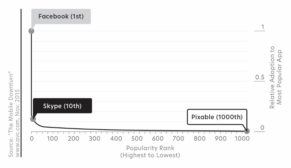
The leaders of the organizations that took advantage of the early digital technologies made simplicity the rule. On Facebook, you “like.” On Google, you “search.” On Pinterest, you “pin.” On Twitter, you “tweet.” They realized that there is rarely a second chance to make a durable first impression. They found that the most effective digital experiences build user habits around a single function. Each of the top-performing apps has one thing in common: a single function.[iii] (Figure 28)
Understanding the need to deliver a high-quality experience throughout the life of a digital product or service means knowing that the best experiences hide system complexity behind a simple, seamless user experience. This requires coordination between back-end infrastructure, front-end designs, and all the millions of lines of code and algorithms in between. One of the most famous and valuable examples of this principle is Google.

While other search engines relied on complex search interfaces with multiple text boxes and filters on the page, Google dedicated itself to having the single text box and search button. It forced its engineers to deal with the massive complexity involved in sophisticated searches and deliver a simple and intuitive experience for customers behind that interface. (Figure 29)

Disney has taken the same approach at its parks, enabling its customers to focus on the experience, the magical. The Magic Band delivers great memories by improving the entire Disney adventure, hiding immense system complexity behind a simple ‘touch’ interaction. (Figure 30)

You might think that this obsession for customer-facing simplicity is relevant only in digital strategies that concentrate on deep customer engagement and are not relevant to a digital executive trying to build a digitized support system, a connected product, or a B2B eCommerce platform…but you would be wrong. It is equally important. Every additional step you add for the user is friction in the system. It increases the user’s frustration, it increases the amount of training and support they require, and ultimately, it decreases the amount of time they spend with you.
Experienced digital leaders know to focus their customer’s digital interactions on the critical few functions, and to make the user interface simple by hiding the complexity that makes the interaction valuable to the customer.
[i] “Watermark Consulting 2019 Customer Experience ROI Study—Demonstrating the business value of a great customer experience.” www.watermarkconsult.net.
[ii] “80-20 Rule,” Carla Tardi, reviewed by Marguerita Cheng, Investopedia, updated May 25, 2020.
[iii] “The Mobile Downturn (continued),” www.avc.com, November 2015